I wanted to get some experience in creating my own content and potentially making them available for commercial purposes, the issue was I wasn’t sure what I could work on that might help me achieve this goal. What could I create that people might buy? To work towards the potential end goal of selling content commercially, I decided to create a collection of 12 icons / illustrations that a specific group of people (whether it be professional designers or something people might want for their own content). This could be for any subject and the style would be entirely my choice, but it must appeal to a specific audience.
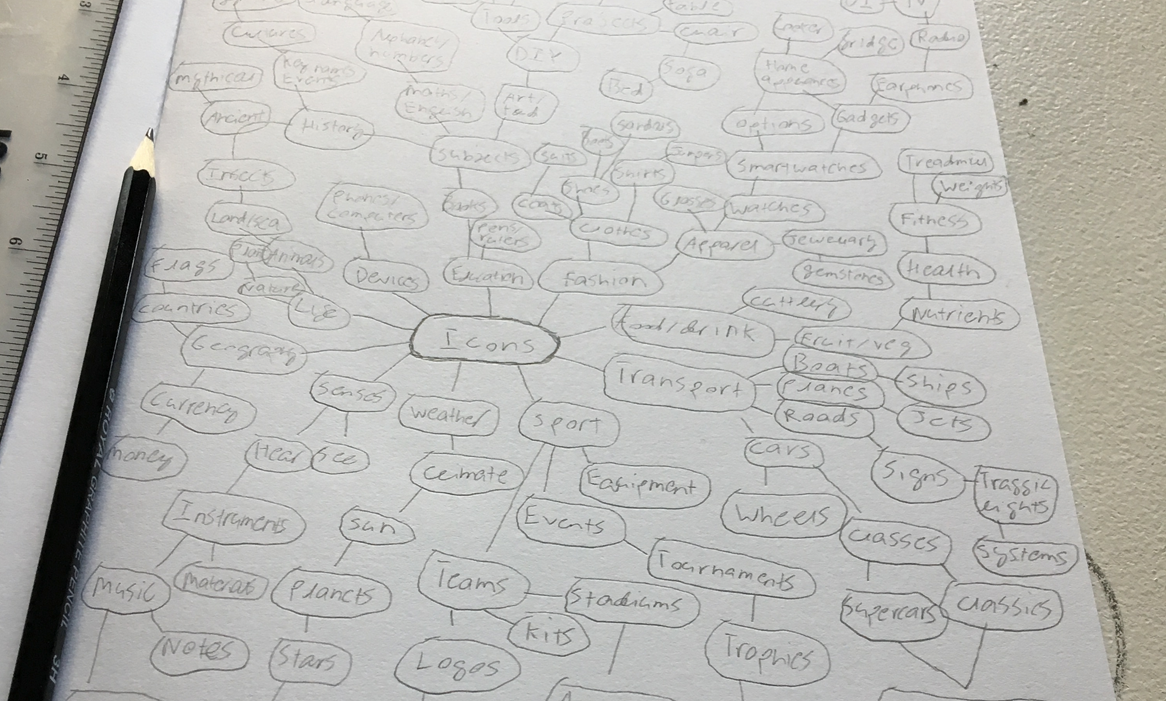
The very first and pretty common exercises you take when searching for inspiration on what to do is brainstorming. Without really having an idea on what I was going to pick as the subject of the icons / illustrations, I jotted down various words and branched them out to things that were related to them, and interconnected with other branches. By the time I had filled out a page with various keywords and topics, I started to think about things which interested me: sport, cars, technology and so on. After a while, it then occurred to me – I like geography, countries and such. What could I do that is related to that? Flags? Badges? Landmarks? Landmarks, that sounded interesting to me. People would be interested in illustrations of the Eiffel Tower, the Colosseum, the London Eye and so on, so why not work on something like that?
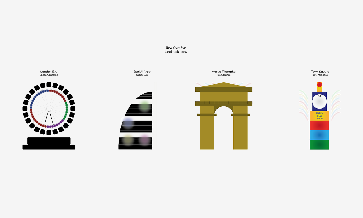
This was around October, so of course the festive season was not too far away. I wanted this to be a commercial project so how could I tie that with landmark icons? New Year’s Eve. As you’ll know it is common for people to gather around famous locations when the new year approaches, so I decided to work on landmarks with a New Year’s Eve twist. An icon with the London Eye could have fireworks around it for instance, or something similar around the Sydney Opera House. I searched different famous landmarks to see what ones could work best. I wanted to keep the quantities of each continent as spread as possible, so if viable, I’d make 3 from Europe, 3 from Asia, 3 / 4 from North / South America etcetera.
After a while, I unfortunately had a change of heart, due to circumstances going on I felt that maybe advertising landmarks could be an uncomfortable topic to work with, so I sadly decided to go with a new idea. Frustratingly starting back from scratch, I had to rethink what subject I could go with for my icons collections. It then occurred to me that I really like watches. The design of some well known brand watches appealed to me a lot. The complexity of the designs was something that filled me with doubt, but I decided it would be a good opportunity to work on my illustration skills.
“The design of some well known brand watches appealed to me a lot.”
I looked up different watch brands from Rolex to Omega. I wanted to see if there were 12 popular watch brands so I could have some variety. Luckily, I did just that. Searching up famous watches throughout history, I decided to design the following watches – 12 separate brands: Audemars Piguet, Breitling Navitimer, Cartier Tank, IWC Portuguese, Jaeger LeCoultre, A.Lange & Sohme, Omega Speedmaster, Panerai Radiomir, Patek Philippe Calatrava, Rolex Submariner, Tag Heuer Monaco and Zenith El Primero. I felt with a bit of time and practice, I could eventually create these designs, starting off, was the daunting part however.

I wanted to keep the design process as streamlined and as ‘simple’ as possible. In order to do this, I wanted to keep the straps and watch face designs consistent, whilst still modifying them to look their original selves. Once I had the bodies created, I could then start working on the specifics of each watch. Naturally, I started with the ones I felt were the easiest to design, which were the Audemars, Jaeger and Patek. Mathematics would prove to be a huge part of the process, as I would need to rotate the seconds on the watches around the watch face, and this would be done numerous times on each watch for the specific parts. Then I started working on the watches that had a bit more variety in terms of shape and features, such as the Cartier, IWC, Panerai, Rolex and Tag Heuer. Tweaking the shapes and rotating certain aspects were more of a challenge. The most difficult ones I felt were the Breitling, A.Lange & Sohne, Omega and Zenith, due to the amount of detail they consisted and the composition of certain elements. Rotating the seconds elements were tougher because they weren’t as simplistically aligned in comparison to the other watches. This was the case with the Breitling, Omega and Zenith.
Some of the watches logos were more complex than others, such as the Breitling – which had some complex aspects; the Jaeger LeCoultre logo was a little awkward due to the curves at the bottom; even the A.Lange & Sohne to an extent, for the fact I wasn’t sure how to rotate the text around a shape, but managed to figure it out; the Omega logo was similar to the Jaeger one, production-wise; the Rolex logo was a slight challenge getting the shapes correct and aligned appropriately, but the Tag Heuer logo was one of the trickier ones, due to the stylized text, and this required editing to the text. Another aspect was the typographic fonts. I spent a lot of time searching fonts that were as similar to the ones on the watches as possible. After the watches were designed, it was then a matter of adding the colour. This also took some time, although not as long as creating the watches. It required the use of gradients, altering the opacities and rotating the colour positions to try and make them as realistic as possible. Once the colours were added on, it was just a case of checking everything was worked on and nothing missed, then the watches were complete.
The main aim at the beginning was to work on something commercially, which ended up becoming something more like a passion project, with the potential to use for commercial purposes. What I did gain from this was the capability to work on more detailed illustrations, which can come very handy in future work. It was regretful that I didn’t continue with the landmarks icons, but I may consider coming back to this in the future. I also aim to explore the commercial possibilities of the watches illustrations rather than just making them available to download. I put a lot of time into the designs and feel I wouldn’t be doing myself justice to just give them away for free.
Maybe I could look outside the illustration / icon field and see if there’s a different avenue I can take them. Of course, there’s ways I could’ve done the designs differently, perhaps spend more time working on colour to make them even more realistic, that would definitely be something I’d consider practicing with. Structurally and in terms of the shapes / logos I can definitely continue improving, but for a first time doing something as detailed as this, I feel quite satisfied with the end product.