Whilst creating websites for myself in the past, I would go with colours and layouts that I thought looked cool, and I’m not alone in this case. As time went on I came to the realization that I had no real visual identity to present to people. I decided to work on my own brand identity; one that reflected my own personality as an individual and as a designer, my styles, my tastes. It had to connect to a background story of myself, it also had to represent what my beliefs, values, goals, purposes and how I envisage the future could and should be. Fitting all this into a brand identity is no easy task.
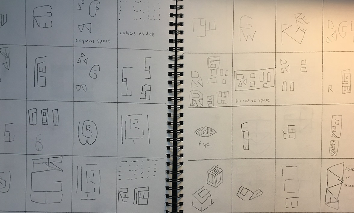
I started off by creating squares of 40 on paper and drawing different ideas; some were similar, some were different. Having tried designing a logo for myself in the past, I have found my initials (RGW) to be rather difficult. The drawings consisted of various ideas including ways of joining my initials together, creating patterns with the structure of the letters, putting the initials into shapes, such as an eye (which would be a personal touch to me, due to my eyesight). I also put together moodboards to aid in with my inspiration. I used different combinations of my initials as I couldn’t find any valuable ideas with all three initials together in that order. I tried RG, RW & GW.
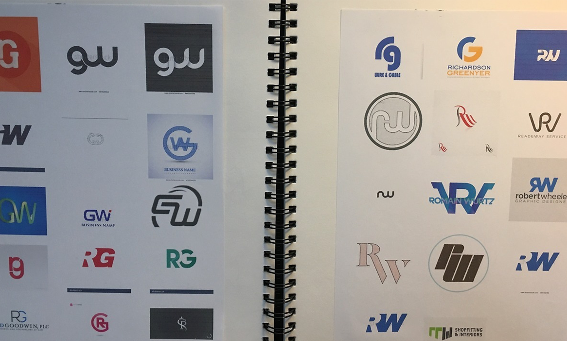
This was a useful process to go with and aided my thinking a little further. What also helped my imagination further was to collect some other unrelated logos just to see if that could also help me think of any quirky ideas. I had initially persevered with one idea, which was a square with four squares. The first two on the left created an R, the top right square formed a G, whilst the bottom right square created a W. I was optimistic with this idea as I felt this would fit my initials the most. I played around with different variations of the idea (working on line thickness, line decoration / pattern, line colour & square colour.
After various tweaking and feedback on the different versions of the logo, I came to the conclusion that perhaps this logo idea was not the one to go with. That was frustrating. I would then go back to the drawing board and be open-minded about my previous sketch ideas to see if I could find some new potential in them. I also sketched down some ideas for a visual marque. I considered what resonated with myself personally. I tried designs of keys combined with pens, eyes with a colour wheel and so on. I felt it needed to be more creative than that and have a better background story of myself. Also important for a designer is to include their own brand guidelines.
“I considered what resonated with myself personally.”
Within brand guidelines normally include a mission statement, your vision, values & tone of voice. There would usually be a section for the monogram – a description of it, its clearance areas and its accepted and rejected uses; the same would be included for your branding’s wormark and visual marque. Colour palettes would also be included including the codes for your brand colours; a typography section features a headings page, sub-headings page and also one for a substitute font if a client was unable to use the original font for your wordmark; finally a layouts section may be featured to present how their branding could be shown on letters, billboards and so on.
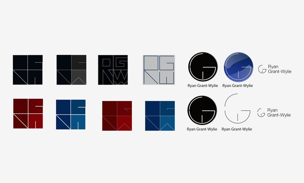
After going through plenty of time trying out ideas, developing certain ideas further, going back to the drawing board and repeat, I finally came to the desired solution. The logo is a cut-up G, with the top-left stroke representing an R, the overall body representing the G, and a line in the center forming the W. Something I was always hesitant about was making the G or the W the main letter in the design, but having seen other logos with a similar look, it convinced me to go ahead with the idea and I never looked back. I went with a blue gradient as I felt it represented my aims for the future (progress) and, after going through research on colour meanings, blue / turquoise suited my personality and my values the most.
For the wordmark I went with a rounded font which matched the curved edges of the logo, this kept the visual presence consistent and representative of the brand. For the visual marque, I designed a pair of glassed with pencils at the end of the frames. This represented a background story for me. When I was younger I would draw a lot, and of course still do now with my work and so forth. The glasses represent my vision, which is important. The brand values I chosen were – approachable, dedicated, focused on detail, passionate, quality, reliable, trustworthy & understanding. Between the logo, monogram, visual marque & brand values, I felt everything tied in together and created a consistent identity for myself.
This was a massive eye-opener for me. Designing a visual identity for myself is not only common but also quite important for companies and brands around the world also, it’s what maintains a consistent presence. I’ve also learned the importance of asking questions right at the beginning of what the branding should consist of. It’s also helped me understand more of myself as a person and my personality (to an extent) in terms of values and how to represent myself articulately also how to help clients with their own branding tasks.
I’ve also realized how much sketching is beneficial to the creative process and the paths that some ideas can take you; moodboards have also aided with this, finding inspiration also helped form new ideas and how they could actually make other ideas I didn’t feel would work actually have potential within them. Overall it was a very beneficial experience and has made me more aware of what it takes to work in the branding sector of the creative industry and also how to find more ideas & possibilities.